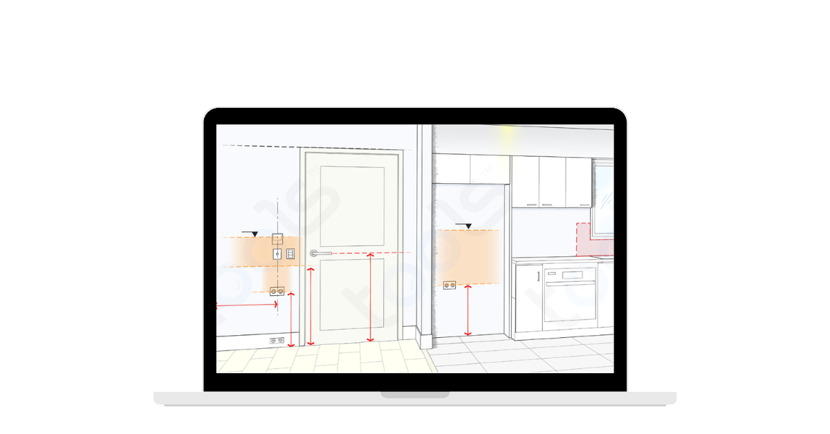
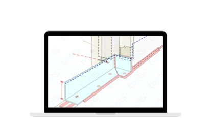
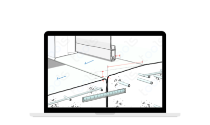
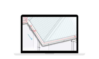
Most setout is common sense ….. but gee, golly, gosh … we get it wrong too often.
Our “Tool™makerette’ Inch has illustrated the fundamentals. So when our back is turned everything should be “plonked” in line (…. that’s a pun  ) or sensibly – without fail.
 ) or sensibly – without fail.
I’ve also included lots of ‘whys’ ….. so if you have a tricky mix of shapes & components, you can use reason to correctly separate, space & ‘craft’ the best outcome. Teachers (that’s most of us on the job) take note of the core messages:
- ‘Meridian Rule’ – Jerry’s considered view that 1m from FFL is a default position for accessible stuff
- margins / frame / gauge ….. everything must be equal / centred / in line etc
- plan the layout eg where the full tile starts, where the light will provide best illumination etc
- ergonomics is NOT a dirty word …… make sure everything you design & install can be easily used esp. tap handles, garage door remotes, signage so it is visible etc.
ppsssstttt …. I think this will replace Metal Compatibility as our No 1 Tool™.
NB. This Tool™ will not harm or disagree with any documented dimension or location where indicated by a Designer or required by a Manufacturer.

 1 min read
  01 November 2024


