Navigating Luminance Contrast: A Bright Idea for Safety in Design
Slips and falls aren’t just minor mishaps; they can have life-altering consequences for our loved ones and customers. One of the leading causes of these accidents is the failure to notice changes in elevation or obstacles in one’s path. This is where luminance contrast steps in as a silent yet effective communicator of potential risks in our surroundings.
![]()
![]()
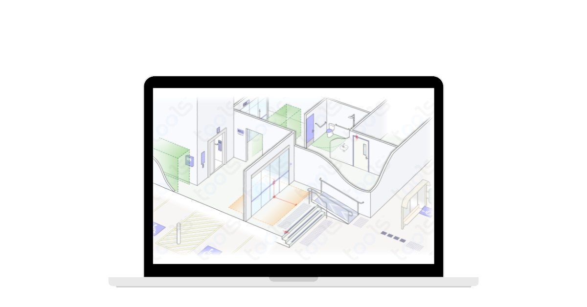
Picture this: you’re walking down a corridor, engrossed in conversation, when suddenly, there’s a step you didn’t see. It’s a scenario we’ve all encountered or, at the very least, worried about. That’s where luminance contrast comes into play, subtly highlighting changes in surfaces and elevations to catch our attention before it’s too late.
But what exactly is luminance contrast, you might ask? Essentially, it’s the difference in brightness between two surfaces. By strategically incorporating varying contrasts between materials, such as steps and walkways, we create visual cues that effectively communicate potential hazards.
Let’s break down the basics of luminous contrast:
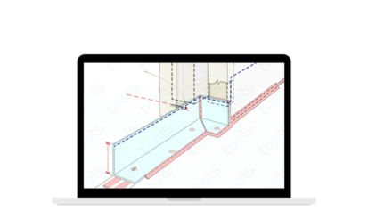
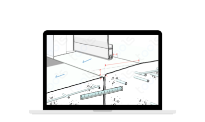
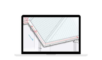
- 30% Contrast Rule: The contrast between different surfaces should ideally be at least 30% to ensure visibility and awareness of potential risks.
- Nosings 50mm – 75mm Wide: Ensuring that nosings (the edge of steps) are within the specified width range further enhances visibility and reduces the risk of tripping.
- Glass Indicators Within 900mm to 1m from FFL: Glass indicators, typically 75mm wide, should be strategically placed within this range from the finished floor level to effectively communicate hazards.
- Visible Within 2m: Visual cues should be easily discernible within a 2-meter radius to effectively catch the attention of individuals navigating the space.
While luminance contrast is a critical component of safety design, it’s just one piece of the puzzle. In conjunction with slip-resistant surfaces, adequate lighting, and intuitive wayfinding, it creates a comprehensive safety net that minimises the risk of accidents.
Imagine navigating a space where every potential hazard is subtly highlighted, guiding you safely to your destination. It’s a simple yet powerful concept that has the potential to prevent countless accidents and injuries.
And speaking of simplicity, simplifying building codes is another step towards enhancing safety in design. Tools™ offers a solution by transforming the National Construction Codes (NCC) into interactive, easy-to-understand graphics. By incorporating deemed-to-comply and best practice information, Tools™ helps prevent costly mistakes and maximises efficiency in building design and construction processes.
At the end of the day, ensuring safety in our built environments isn’t just about meeting regulations; it’s about creating spaces that prioritise the well-being of everyone who interacts with them. So let’s embrace the power of luminance contrast and innovative tools like Tools™ to create safer, more accessible spaces for all. After all, when it comes to safety, every detail matters—even the brightness of a step or the clarity of a sign.